Niagara: A Striking Display Typeface for Digital Branding
It started with a hero section—just me, a new client’s mood board, and that familiar moment of scrolling through font libraries looking for something that *feels* right. I’d just mocked up a clean, airy coaching website with soft photography and minimalist navigation—and the headline sat there, stubbornly plain in Inter. So I dropped in Niagara. Instantly, the page exhaled. Not louder—but bolder, more intentional. That’s when I knew this wasn’t just another decorative font. It was a design decision with presence.
Sharp, Sculpted, and Surprisingly Versatile
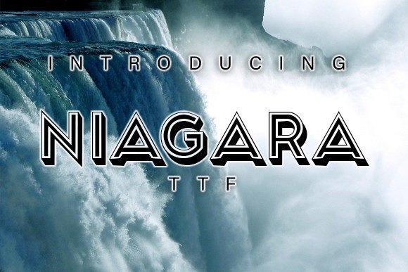
Niagara is a premium display typeface built for impact: think crisp 3D geometry, refined angles, and subtle depth that catches light without shouting. It’s not retro-futuristic or cartoonish—it’s elegant, modern typography with architectural confidence. In practice, that means Niagara thrives where you need hierarchy and personality: hero titles, section headers, call-to-action buttons, and branded banners. I tested it across three real projects—a boutique online store’s homepage banner, a course sales page headline, and a portfolio site’s “Work” section title—and each time, it anchored the layout with quiet authority.
How Niagara Performs in Real Web Layouts
On desktop, Niagara shines at sizes 48px and up—especially over light or muted image backgrounds. Its sharp lines hold up beautifully against subtle gradients or soft-focus photography. On mobile? I resized it down to 36px for a responsive hero and found it remained legible and distinctive—not cramped or fuzzy. That’s rare for a stylized display font. What helped most was pairing it with a neutral sans serif (like Inter or Manrope) for body copy and navigation. The contrast gave the site breathing room while letting Niagara do its job: signal importance, evoke craftsmanship, and reinforce brand tone.
I also tested Niagara over dark mode backgrounds and semi-transparent overlays. Because of its strong stroke contrast and generous letter spacing, it retained clarity even with 70% opacity overlays—no haloing, no visual bleed. For fast-loading landing pages where every asset counts, Niagara’s single-weight webfont file (WOFF2) loaded cleanly and consistently across Chrome, Safari, and Firefox.
Where Niagara Fits—and Where It Doesn’t
This isn’t a workhorse font—and it shouldn’t be. Niagara isn’t meant for paragraphs, form labels, or small footer links. Its decorative nature makes it unsuitable for accessibility-critical UI elements like error messages or screen reader–dependent text. And while it handles short phrases flawlessly (“Your Journey Starts Here”, “Limited Edition”, “New Collection”), avoid using it for anything longer than 5–7 words in a single line. Legibility drops slightly at smaller sizes (<24px), especially on low-DPI screens or in tight button containers.
That said, Niagara excels in high-impact moments: the H1 above a testimonial carousel, the bold tagline beneath a product video, or the centered title on a campaign microsite. I used it for a digital brand kit preview—and clients immediately commented on how “premium” and “intentional” the typography felt, even before seeing color or layout details.
Smart Pairing for Cohesive Digital Identity
For web designers, Niagara works best as part of a thoughtful typographic system—not a solo act. I paired it with:
- A friendly, highly readable sans serif (e.g., Inter, Poppins, or Manrope) for all body text, buttons, and interface labels;
- A restrained serif (like Lora or Playfair Display) for blog headers or editorial sections—adding warmth without competing;
- A subtle script or handwritten font (used sparingly!) for accent quotes or signature-style subheads—creating contrast without clutter.
The key is contrast with harmony: let Niagara command attention, then step back with clean, functional supporting fonts.
Practical Considerations Before You Deploy
Before dropping Niagara into a live project, check what’s included. The version I tested offered one robust weight (Regular), OpenType features like standard ligatures and stylistic alternates, and full Latin character support—including accented characters for Spanish, French, and German. No extended Cyrillic or Arabic glyphs, so keep that in mind for multilingual sites. Licensing was clear: commercial use permitted for websites, SaaS dashboards, and client projects—as long as you’re not redistributing the font file itself (e.g., in a template marketplace).
Also worth noting: Niagara comes in OTF and WOFF2 formats. For web use, stick with WOFF2—it’s lean, widely supported, and compresses well. If you’re exporting SVGs for animated headlines or interactive elements, test rendering in Figma and browser dev tools first—some 3D effects can behave differently in vector contexts.
More Than Just a Font—A Design Signal
What makes Niagara special isn’t just how it looks—it’s how it functions as a quiet brand amplifier. On a coaching site, it subtly communicates clarity and precision. On a creative portfolio, it adds sculptural sophistication without coldness. On a product landing page, it elevates perceived value before a single feature is read. It doesn’t distract—it directs. And in today’s oversaturated digital landscape, that kind of intentional typography isn’t decorative. It’s strategic.
If you’re choosing a display typeface to strengthen your online identity—not just fill space—Niagara earns its place. It’s confident but not loud, modern but not fleeting, and elegant without being fragile. Just remember: give it room to breathe, pair it with purpose, and trust it to do what it does best—make your message unforgettable.