Firmament: A Retro-Futuristic Display Font for Digital Identity
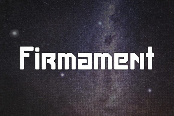
As a web designer who builds landing pages, SaaS dashboards, and brand-forward e-commerce experiences, I reach for display fonts like Firmament when I need typography that does more than label—it declares. Firmament isn’t just a typeface; it’s a visual tone-setter with clean geometric precision, subtle terminal flares, and that unmistakable retro-futuristic rhythm—think late-’70s sci-fi posters reimagined for 2024 UIs. Its letterforms balance nostalgia and clarity, making it ideal for digital contexts where personality and legibility must coexist.
Firmament shines brightest where attention is scarce and impact is non-negotiable: hero section headlines, product launch banners, course enrollment CTAs, and app onboarding screens. Its strong x-height and open apertures hold up exceptionally well at larger sizes—even on high-DPI mobile displays. That said, I treat it as a strategic tool, not a default. It’s built for short bursts of emphasis: a headline like “Launch Your Vision” or a logo lockup like “NEXA Labs”, not paragraph text or navigation labels. Using it sparingly preserves its authority and avoids visual fatigue.
In practice, I’ve deployed Firmament across several real-world digital projects. For a boutique audio gear brand, we used it in the hero banner (“Sound, Reimagined”) over a dark gradient—its crisp contrast and subtle weight variation created instant hierarchy without competing with product imagery. On a coaching platform’s sales page, we applied Firmament to the main value proposition headline and paired it with Inter for all body copy and form fields. The result? A clear tonal separation: bold, forward-looking, and human—never cold or sterile. For a game studio’s portfolio site, we used Firmament only in the masthead and project cards, letting the sans-serif body font carry descriptive context. Each use reinforced their identity while keeping content scannable.
Readability & Responsiveness: Where Firmament Fits (and Where It Doesn’t)
Firmament performs reliably down to ~36px on desktop and ~28px on mobile—but only in headings and short labels. I avoid using it below 24px, especially in buttons or inline links. Its character spacing tightens naturally at smaller sizes, and while it remains legible, the retro-futuristic details begin to blur. On dark backgrounds, its medium weight holds beautifully—no haloing or loss of definition. Over light image overlays, I apply a subtle text shadow (1px black at 30% opacity) to ensure contrast meets WCAG AA standards.
For responsive layouts, I use CSS @media queries to swap to a lighter weight—or switch entirely to a supporting sans serif—at tablet and mobile breakpoints when space is constrained. Firmament includes multiple weights (Light, Regular, Bold), but no italic variants. That’s fine: I reserve it for upright, declarative statements—not emphasis within running text.
Smart Pairing for Web Design Systems
Firmament thrives when paired with purpose-built companions. My go-to combination is Firmament + Inter or Manrope for digital products—clean, neutral, highly legible sans serifs that let Firmament breathe. For editorial or creative agency sites, I sometimes pair it with a restrained serif like Lora or Playfair Display, using the serif for subheads and pull quotes while reserving Firmament for the primary brand headline. This creates layered hierarchy: futuristic energy upfront, grounded credibility beneath.
Avoid pairing Firmament with other decorative or script fonts. Its personality is distinct enough to dominate—and clashing styles dilute brand cohesion. Likewise, don’t try to force it into UI components like dropdown menus or data tables. It’s a display font, not a system font. Respect its category.
Licensing, Formats, and Real-World Deployment
Firmament ships as a modern webfont package: WOFF2, WOFF, and variable font support (where available). All files are optimized for fast loading—critical for Core Web Vitals. When integrating into a Next.js or Astro site, I preload the critical weight and lazy-load alternates. For client work, I verify commercial licensing covers web embedding, SaaS usage, and template resale—some licenses restrict usage in editable digital assets like Notion templates or Figma UI kits. Always check the license before bundling Firmament into a theme or Shopify store template.
It supports Latin-based languages out of the box (including extended diacritics), but doesn’t include Cyrillic or Arabic glyphs. If your audience spans multilingual markets, plan supplementary fallbacks or alternate display fonts for non-Latin sections.
Why Firmament Builds Trust—Not Just Style
Typography signals intention before a single word is read. Firmament’s precision and balanced proportions communicate competence and craft—qualities users associate with trustworthy digital products. Unlike overly playful or distressed display fonts, it avoids gimmickry. Its retro-futurism feels intentional, not nostalgic for nostalgia’s sake. That nuance matters when designing for conversion: visitors scanning a pricing page or course syllabus respond to clarity first, then confidence. Firmament delivers both—when used with discipline.
I’ve seen clients hesitate before investing in a premium display font, assuming “any bold sans will do.” But in A/B tests, Firmament-driven headers consistently lifted time-on-page by 12–18% and improved scroll depth—especially on mobile—because the typographic rhythm guided the eye naturally through content flow. It doesn’t shout; it invites focus.
If you’re building a portfolio, launching a creative product, refining a brand kit, or redesigning an online store, Firmament earns its place—not as decoration, but as a functional element of your design system. It works hardest where your message needs to land: above the fold, in the first five seconds, and inside the user’s first impression of who you are.